Great news: we’re extremely pleased to announce that we were named as a finalist for the MM&M Awards in 2016. You can read more about the details in our press release here.
This finalist selection resulted from the work we did on the website for one of our clients, ClearFlow. ClearFlow, a California-based medical device manufacturer, was able to triple their revenue within the first year their website went live. The second year brought even more impressive results: a five-fold increase in revenue!
But the purpose of today’s post isn’t to brag. What really captured our interest was trying to figure out what exactly made the ClearFlow website so effective– and how you could break down those elements and apply them yourself.
Here are some of the key elements that have made the ClearFlow website such a driving force in their business. Hopefully seeing those elements in action will make it that much easier to integrate them into your healthcare website as well.
One of the biggest challenges we faced when working on the ClearFlow website was a lack of awareness. Because many people didn’t even know about Retained Blood Syndrome (RBS) or the potential severity of the consequences, this limited the perceived value of our client’s ingenious device.
That meant the content on the ClearFlow website had to be informative and engaging in two distinct areas. Instead of just launching into the specifics of the PleuraFlow product, we used the home page to raise awareness about RBS before introducing the solution.
We couldn’t afford to assume that the website audience (here, a wide range of people including hospital administrators, medical professionals, and even potential patients) knew about the RBS problem–much less the potential severity. This is especially true for complex, cutting-edge healthcare products like wearables.
Without carving out enough space to convey the nature of the problem, you leave it up to visitors to read between the lines and guess what the value of your solution might be.
With the typical healthcare website, there’s a ton of pressure to deliver a lot of complex information in a compressed space. Your key message has to get through the ever-shortening time frame of the average attention span.
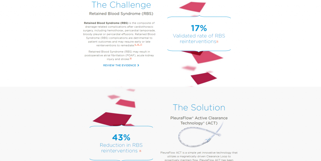
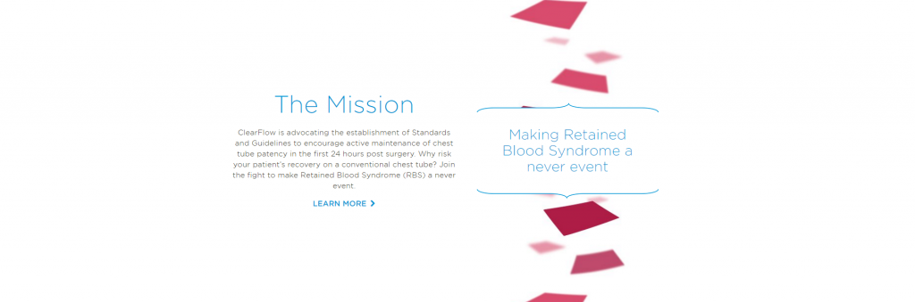
These challenges were doubled with the ClearFlow project, because we needed to devote as much attention to the newly-defined problem, RBS, as the PleuraFlow solution. This led us to break up the website content into three major chunks: 1) Challenge, 2) Solution, and 3) Mission.
If you take a look at the ClearFlow homepage, you’ll see that we decided to guide visitors through the experience from top to bottom–first the problem, then the solution, and finally the mission. This creates a logical flow that’s easy for a first-time visitor to follow, making it more user-friendly than if we’d displayed the content randomly or jumbled together.
At the same time, we still give users some control by offering them the option to click links to internal web pages for any content chunk that catches their interest. Notice how the Mission section includes a link for visitors to learn more:
This structure lets ClearFlow use the homepage to give visitors a nice overview, while saving the internal pages for more complex information. We also made sure to use headings, subheadings, and other visual elements to make things easy on the eyes as visitors read and scroll.
We needed to make sure that medical professionals, hospital administrators, and potential patients understood the scope of the RBS problem–as well as PleuraFlow’s ability to solve it. To that end, we made sure to include plenty of data and study results to support our client’s claims.
We also recognized that the average ClearFlow website visitor would be very busy. Sure, we hoped they might download a PDF or pull up a few studies. But life gets in the way. That’s why we relied heavily on visual elements and infographics, which work well to convey complex information and data points quickly.
Here’s one highlighting the health and financial impact of Retained Blood Syndrome:
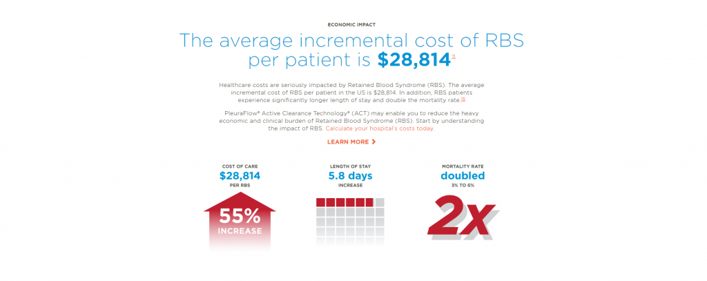
This content isn’t just striking to the visitor’s eye; it’s easy to digest. Anyone can see these graphics and understand them within seconds–no medical degree or specialized training required.
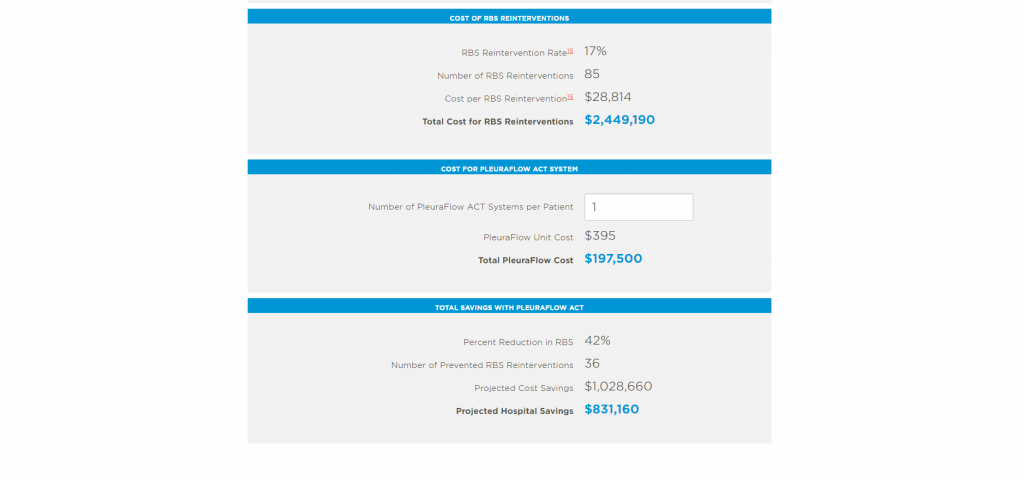
We also wanted to get people to grasp the cost-saving benefits of PleuraFlow devices in concrete terms. This led us to develop a special cost calculator tool on the website. Visitors are able to plug in numbers and compare the staggering costs of RBS re-intervention measures with investing in PleuraFlow. This really hammers home the value.
Here’s the tool calculating projected savings for a hospital with 500 cardiac surgery procedures yearly:
Instead of dedicating the ClearFlow website to selling as aggressively as possible, we wanted to carve out some space to offer value–whether or not the visitor ever becomes a customer. Using their website as a platform to raise awareness about RBS is in line with the ClearFlow mission–and a great chance to do some good.
The website resources, FAQ sections, and blog help our client do just that. There’s a little something for everyone here, whether you’re a surgeon wanting to watch an animated video showing how the installation process works, a would-be patient curious about RBS, or even an administrator wondering if PleuraFlow should be implemented into your hospital’s Quality Management System.
Here are some of the files and videos hosted on the ClearFlow resources page:
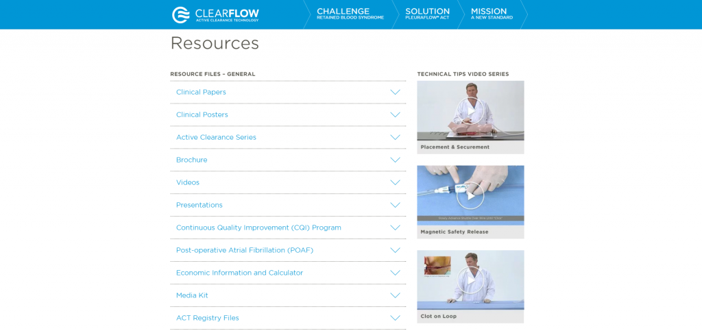
A good chunk of this information is technical. But we did everything we could to convey a clear meaning with the help of visual aids, brochures, and even videos. We wanted to build credibility and get visitors not just stopping by once, but coming back for more value.
These resource and FAQ pages also serve the ClearFlow sales reps. Having all this valuable information in a single, easy-to-access platform helps compress sales cycles because it gives reps the tools they need to overcome objections, answer questions, and even direct prospects to find out more on their own.
We are absolutely thrilled to be selected as a finalist for the MM&M Awards, but we’re even more excited with how much the ClearFlow website and branding strategy is growing their business!
You can do this too. While the details vary depending on the specific healthcare product or service you offer, including the key elements above will help you stack your chances of success.