More people than ever are researching health issues– and making purchasing decisions based on that research– online. This goes for typical hospital patients, to medical professionals and sophisticated corporate clients.
Savvy healthcare marketers have recognized the need to adapt their approach. But, as more of them go digital in response to customer demands, many overlook a key element: landing pages.
What are landing pages? Why do they matter? And most importantly, how can you make them work for you?
Keep reading to find out!
A landing page is a specific page within your website. Unlike your homepage, which gives visitors a general idea of 1) who you are, and 2) what you do, the landing page is much more targeted.
Businesses use landing pages in a variety of industries. Consider a retailer who sells a hundred different types of shoes on an e-commerce website. Each product could get its own landing page. This makes it a lot easier for visitors interested in specific shoes to find the relevant info–instead of sorting through the entire catalog on the homepage.
An effective landing page only includes content relevant to a specific topic and audience. While your brand might sell a suite of products or services intended for different audiences, a landing page narrows the focus to, say, fibromyalgia symptoms for postmenopausal women. You might have a handful– or even dozens– of landing pages within your website.
Each landing page also urges the visitor to act immediately after engaging the page. This action brings the visitor one step closer to becoming a customer. The idea isn’t to just have someone read the page; it’s to get them to navigate to another page, join an email list, or even buy.
Landing pages are crucial for healthcare marketers because they help break down the search for health care, which is often time-consuming and complex, into manageable steps.
Imagine you’re marketing a wearable device that monitors sleep duration and quality. It takes multiple steps to get the average person to understand the downsides of failing to monitor their sleep, see how your device could help them, and convince them that it’s worth their while.
Imagine trying to throw all of that information at someone the first time they visit your homepage! They’d be completely overwhelmed. Busy people don’t have time to sift through all the information and figure it out. Most of them will move on.
But if you use landing pages, you could break down the process and keep visitors’ attention. Each landing page could support the others, allowing visitors to work through the sales cycle.
Unlike small-ticket retail items, whose buyers usually only consider the price and value, healthcare customers also have to consider the emotional effects of often life-changing decisions. Landing pages serve as bridges to guide them through the journey. Visitors to the landing page get the specific information they need which makes it easier to start interacting with your company or service(s).
Now that you understand how landing pages can help you, here are a few tips to make them as compelling as possible:
A good landing page should match visitors’ expectations. Whatever link (a PPC ad, link from your homepage, etc.) the visitor clicks on creates certain expectations about what they’ll find on the other side. They get frustrated when there’s a mismatch between what they thought they’d find and the actual landing page content.
Imagine you’re looking for a weight loss clinic. You’re browsing Google and stumble upon this ad:

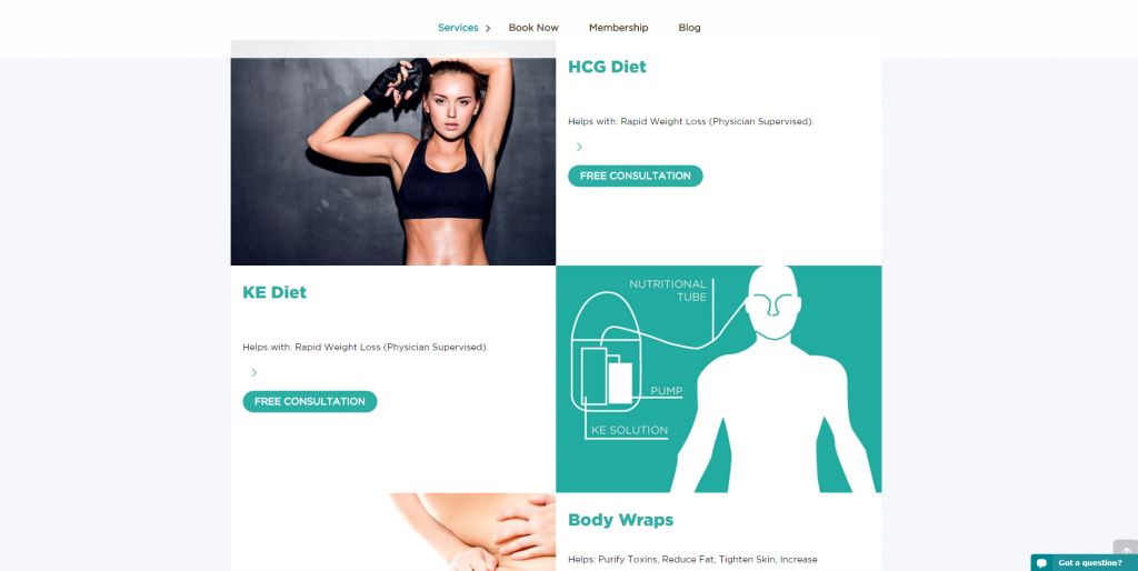
Sounds promising, right? So you decide to click on it. But then you’re directed to this page:

See the problem? While there’s some weight loss content here, there’s also a lot of superfluous content (body wraps and a useless navigation menu). Because our expectations weren’t exactly met, we end up irritated and confused. We go to other websites instead.
Fortunately, it’s pretty easy to meet these expectations with a little care. Take a look at the navigation menu on your homepage, as well as your online ads. How well does each link align with the content on the other side? Serving up relevant information– and stripping away everything else– is the first step to an effective landing page.
Your landing pages should also be hyper-targeted. A landing page serves 1) a specific group of people, 2) looking for specific information, and 3) has a specific goal in mind.
Remember, we aren’t trying to explain the nuances of your healthcare product and sell it within the span of a single landing page. Each page plays a key role in your overall marketing strategy. But the individual pages tend to be short and sweet.
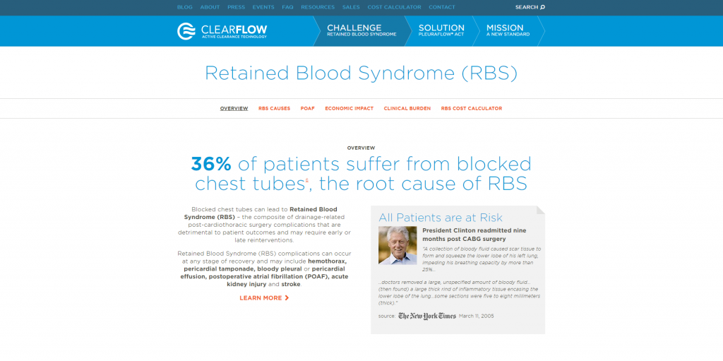
Take a look how a landing page we designed for our client, ClearFlow, does this:

The entire purpose of the landing page is to educate visitors about the danger of Retained Blood Syndrome. We aren’t trying to sell the device; instead, we’re focused exclusively on people who aren’t aware of the severity of the danger.
Say you’re selling a medical device that offers less invasive glucose monitoring for diabetics. Some visitors haven’t been diagnosed with type 2 diabetes yet, but they might be concerned about it. An effective landing page might explain common pre-diabetic symptoms– with the goal of having visitors provide their email address in exchange for access to an online assessment. There’s specific content, a specific audience, and a specific purpose.
Healthcare marketing is unique in that the buying process is often long and complicated. With so much at stake– factors well beyond just a price tag– it makes nothing but sense that prospective buyers thoroughly research and weigh their options.
If you’re selling inexpensive retail items, like t-shirts or hats, the buying process is compressed. Someone might land on your website, having never heard of you, and decide to order something within two minutes. After all, the stakes are low: just a few bucks. That explains why these retailers only need landing pages with the goal of getting someone to buy.
But with healthcare, we can’t expect such a short-term result. We need different types of landing pages to appeal to people throughout the buying process. Content featured in the awareness stage is much different than content featured in the consideration or decision stages. Accommodating every stage ensures that everyone gets the information they need to (eventually) become customers.
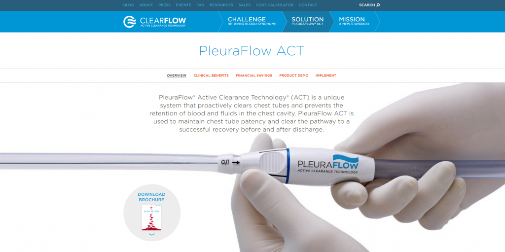
Take a look how we did this for our client ClearFlow:

This landing page is different than the example above because it’s targeted to those in the consideration stage of the buying process. Visitors are already aware of the dangers of Retained Blood Syndrome at this point, so the goal here is to introduce the ClearFlow device as the solution.
One of the greatest things about having landing pages online is how easy it is to test them. Tools like Visual Website Optimizer and Unbounce let you serve multiple versions of your landing page to visitors and see which one performs best.
With a limited advertising budget, this data is invaluable. While you advertise, you can continuously collect data and optimize your landing pages for more engagement. You can test one element at a time (A/B tests) or multiple elements (multivariate tests) to see which combination works best.
Here are just a few landing page elements worth testing:
Landing pages help simplify the complex process of seeking healthcare products and services. They’re great ways to give visitors the specific information they’re looking for– and motivate them to become leads and customers.
If you apply the tips above and are willing to enhance your landing pages and track the results, you’ll make the most of every visitor. There’s no better time to get started than today!
